WPC Smart Compare for WooCommerce

WPC Smart Compare for WooCommerce is apparently a salient tool for boosting the effects of sales strategies for online shops and stores. Upon building this plugin, we have put quite a tremendously large amount of time and effort into researching customer behaviors, popular search mechanisms, and functions. Our smart comparison systems with fully customizable and highly advanced comparing features can take your business to the top with impressive revenues and profits. Most importantly, while our plugin brought about a dramatic escalation of profits for online shops, it can effectively build up satisfaction & confidence for offering customers just what they need.
Feature Overview
- Powerful AJAX functions (there’s no need to open a new tab or iframe)
- Two modes in the comparison table: highlight differences and hide similarities
- Enable/disable Quick Comparison Table for related products
- Customize the position of Quick Comparison Table on single product pages
- Drag and drop to rearrange product order in the comparison line
- Switch between horizontal and vertical view of comparison table
- Adjust the visibility of Compare button for products in selected categories
- Save login data for registered/subscribed users (same function as the Wishlist plugin)
- Automatically prompt related products when searching for items in the comparison table
- Prompt new products instantly when the table is empty or no related products found
- Fully responsive & mobile friendly view on any touch devices
- Dynamic comparison table: sticky first column & row
- Using custom shortcodes to add buttons to specific pages
- Unlimited choice of bar background color and button color
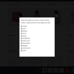
- Hide/show attributes for a clearer view in comparison table
- Smart filter by a selected taxonomy (category, color, size, etc.)
- Compare button advanced settings: type, text, visibility, categories, product removal
- Comparison table advanced settings: fields, attributes, sticky column & row
- Comparison bar settings: Add More button, Remove All button, bar appearance, …
- Support customization of all attributes
- Support customization of all product fields
- Lifetime update & premium support
- HOT: Free support of compare button’s adjustment to customers’ theme design
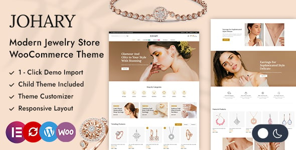 Johary – Diamond Jewelry Store WooCommerce Theme
 Buny – Kids Store and Baby Shop Theme
 Pharmo – Pharmacy Shop WooCommerce Theme
 Bumbleb – Auto Parts WooCommerce Theme
 Majextic – Auto Parts WooCommerce Theme
 Choper – Butcher Meat Shop WordPress Theme
 Ziggy – Pet Shop WordPress Theme
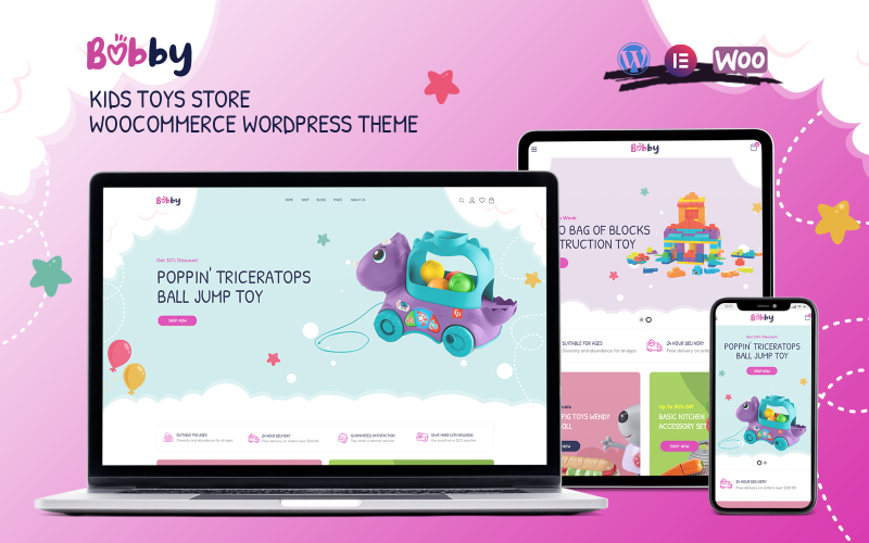 Bobby – Kids Toys Store WooCommerce WordPress Theme
 Cadiant – Jewelry Store WordPress Theme
Why Choosing WPC Smart Compare plugin?
When it comes to determining the value of products, people always have difficulty in deciding if the price is right. That’s when they need one or more similar products to compare. Customers might spend more time browsing through the catalog or store to find something of their interest, but that’s just a waste of time and effort. By putting products together for comparison, this tool helps buyers better pick what’s suitable for them. As customers can have a review on integral features of the products, there’s a higher chance for store owners to persuade them into choosing quality over money and thus into buying more expensive items without promotions.
An Effective Way of Communicating with Customers
We always need to compare an item to another (or even more items) so as to determine how much we are willing to pay for it. The perception of price can be affected by many factors, and one of them is the concept of relativity. By putting a product side by side with other better, more expensive items, sellers are actually making their customers choosing between saving money or enjoying quality. In fact, research proved that how customers decide to buy a product largely depends on the way that store owners communicate information about their products. Therefore, the sellers can imply which the best deal to take is without making explicit notice, which sometimes might be misinterpreted as advertising to buyers.
Best Shopping Assistant for Sellers & Buyers
Your customers mostly react in either way: Buying a cheaper item, choosing the average option and selecting the best. Respectively, these can be translated into three groups of buyers: the “savers”, the “certain” and the “generous”. Whether your customers’ preferences are, comparing goods can be a greater way to provide them with proof about why they should buy from your store. It’s possible for users to add, remove or rearrange attributes with drag and drop method. Moreover, they can even use the predefined fields or add custom fields – a premium feature that might not be found on common plugins. As for customers, they can leisurely add new products to the line aided by the Ajax search, remove unwanted ones by pressing the Close button or repressing the Compare button in the product page. In this way, the comparison will stay objective and reasonable for both buyers & sellers’ sake.
Quick Comparison Table
It’s possible to enable Quick Comparison Table to assist customers in choosing products. While browsing on the single product page, a table showing products that are related to the main product will be displayed for a quick comparison of similar items. This greatly assists customers in considering the right choice and urges them to make better decisions faster, thus, improving the conversion rate a lot.
If users would like to customize the list of these related products on the Quick Comparison Table, they can install the WPC Custom Related Products plugin and configure the list in the Related Products tab of each single product page. Users can also adjust the position of this Quick Comparison Table or replace the Related products section with this. By inviting customers to compare multiple similar products at the same time, the purchasing process will become smoother and more effective.
Smart Design: Horizontal or Vertical View
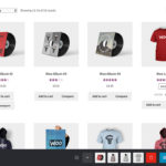
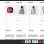
Camming everything in the comparison table just make it harder for customers to make the decision. Anything that has comparable features, whether physical or virtual goods, can be put in a comprehensive comparison with just a few clicks. Users can set the maximum quantity of compared items so that customers can add as many as they want to. There’s no need to worry that your visitors might lose track as the comparison table is compatible for both horizontal and vertical view. Horizontal view (with products as columns and attributes as row) is for comparing a maximum of 5 products. When this number exceeds 5, it’s recommended to switch to the vertical view (the products and attributes exchange the place). This is not only useful for stores that has large product lines but also for multi-vendor shop to compare multiple goods from different companies or brands.
Dynamic Table – Custom as You Wish
Comparing things is always hard work for most of us as we have to consider a lot of aspects, mostly the prices and features, the savings and the benefits we can get, to name a few. Most comparison table is static with preselected products and very little right for visitors to change how the data show. This kind of table might make customers so overwhelmed and bored that they overlook important features. The dynamic table of WPC Smart Compare brings about a whole lot more advanced options for both users and visitors to customize the appearance and comparing results. The dynamic characteristic of the comparison table will always be greatly observed on all kinds of touch devices with different screen resolutions.
Popup View Compatible
Smart Compare provides a dynamic table that can be opened in a popup view and customers can interact more to get a preferable result. They can add new products by entering keywords in the popped up search box or easily remove them by pressing the close button. Compared items are lined up at the comparison bar located on the bottom of the table. When visitors would like to end the comparing session, they can click on the Close button or just click outside of the popup window. They are able to continue from where they’ve been without bothering to go back and forth after the comparing session.
Fully Customizable “Compare” Button
It doesn’t have to be a Compare button, users can set it as a link. In addition, actions to be triggered by pressing it are selectable; they are to open in a popup view or open in a new tab page. The first press on this button will add the product to the comparison line. A hidden feature for users to consider is letting visitors remove the item by repressing on Compare button. If disabled, the second time pressing on it will just open the comparison table without adding a duplicated product to the line. Users can go ahead and change the text of the button or using the default/ its translation for multilingual sites. There’s also an option to remove all items at once for another fresh start. The comparison bar’s position can be adjusted for better browsing experience as well. It can either be placed on the top or bottom of the page.
Stay on Track with Sticky First Column & Row
Commonly, it’s easy to lose track when customers add too many products to the line. They have to scroll up and down repeatedly to compare features. Chances are they will forget what they just read and soon give up on the comparison. As intended for convenience, Smart Compare have an option for users to mark the first column or row or both as sticky. As a result, the first row and column will stay in place as visitors scroll up and down. Moreover, when the features and attributes take up too much space on the popup screen, visitors can choose to Hide or Show them by pressing the button in the corner. The table will shrink or expand accordingly thanks to its responsiveness.
Powerful Comparison Methods
Since version 4.4.0, two brand new comparison methods have been introduced into the compare popup for users to power their comparison and make better decisions. Buyers can now click on Settings, then check/uncheck the respective method to Hide the similarities and/or Highlight differences between compared items.
Social Share Button
There is a way to share a list of compared items to other social accounts via link sharing. When users click on the Share button, a custom will be generated. They can copy the link and share the current being compared list to others via social media.
Comparison Button and Bar Redesign – Hot Freebie
WPC Smart Compare gives unlimited choice of colors for the background and button. But in case you need a personalized customization of compare button to match your elegant heme design, then feel free to contact us. Our developer will consider your theme appearance and help you make the adjustments for FREE. Yet, we are planning to put in more jaw-dropping features for this plugin in the upcoming updates in order to create an ultimate comparing tool for your business to see blooming growth. Please stay tuned and support our plugin.
Onetime purchase - Lifetime update
1-year premium support
7-Day Money-Back Guarantee
After successful payment, the installation file will be immediately sent to your purchase email.
If you have any pre-sale questions, feel free to browse the FAQs or contact us.

